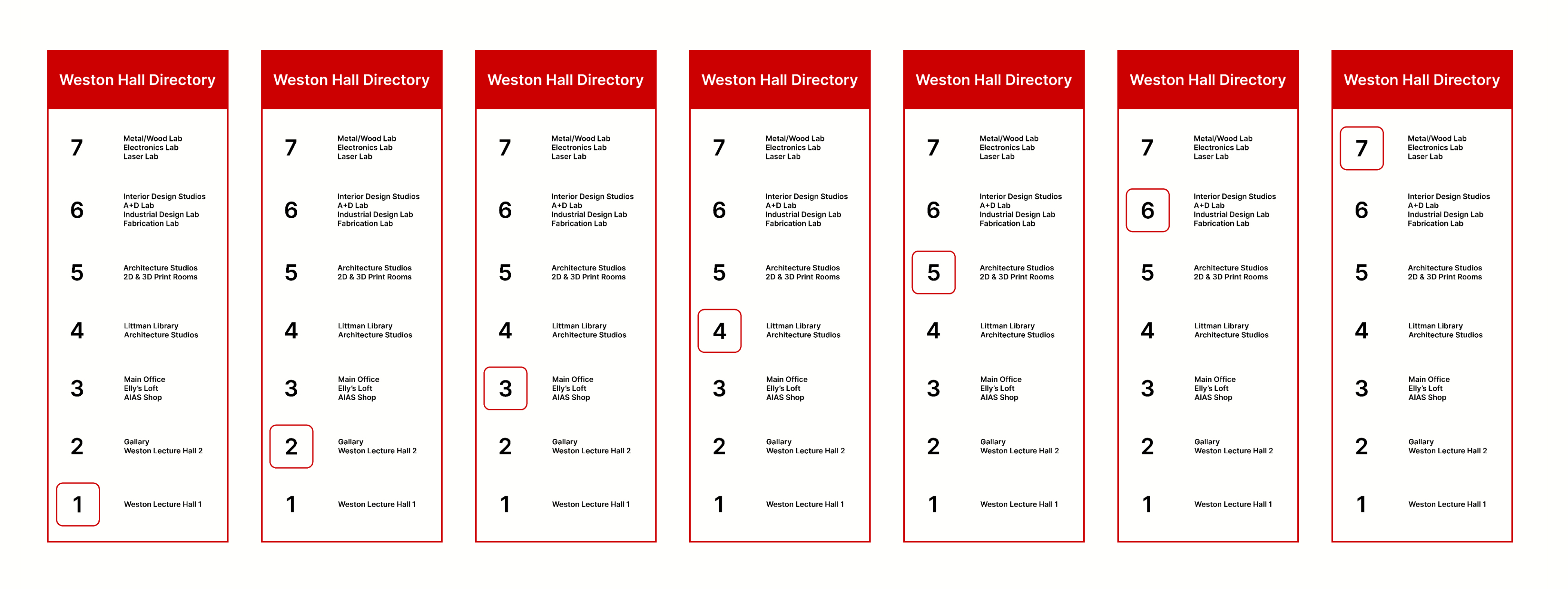
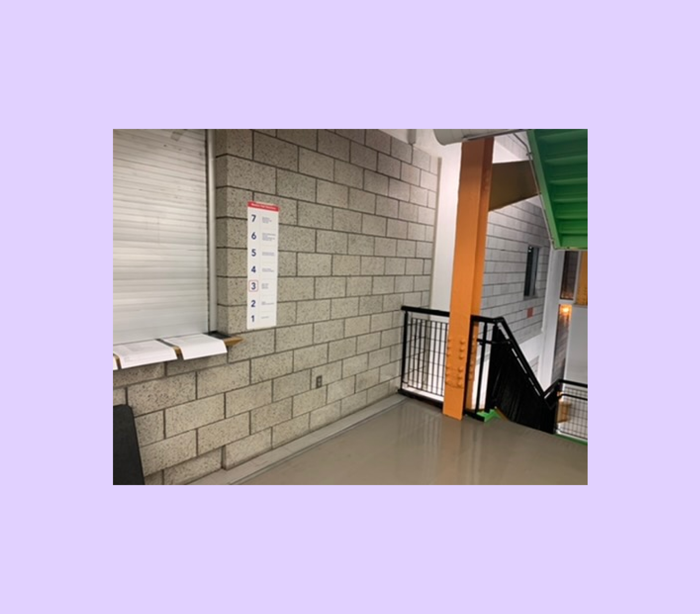
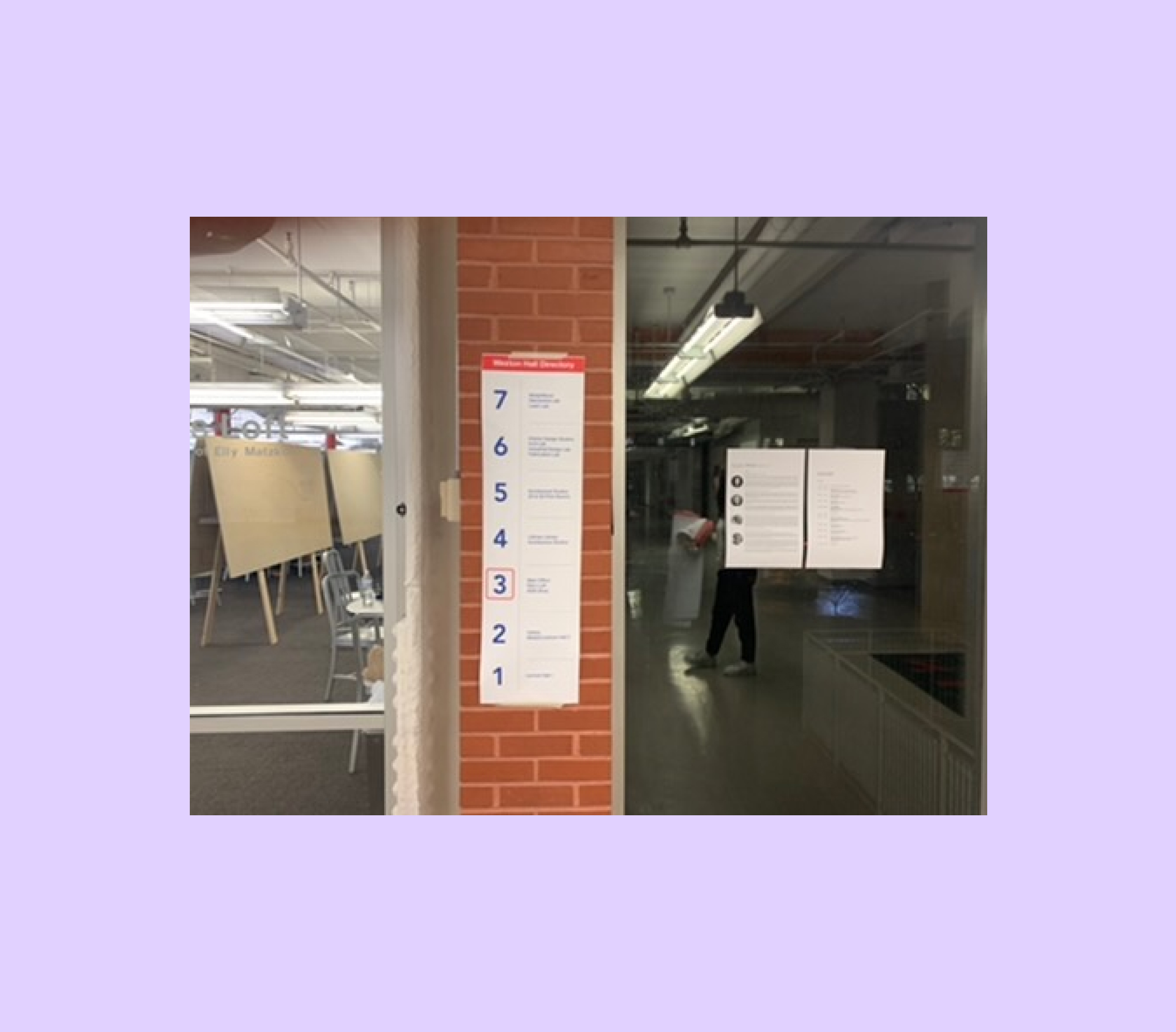
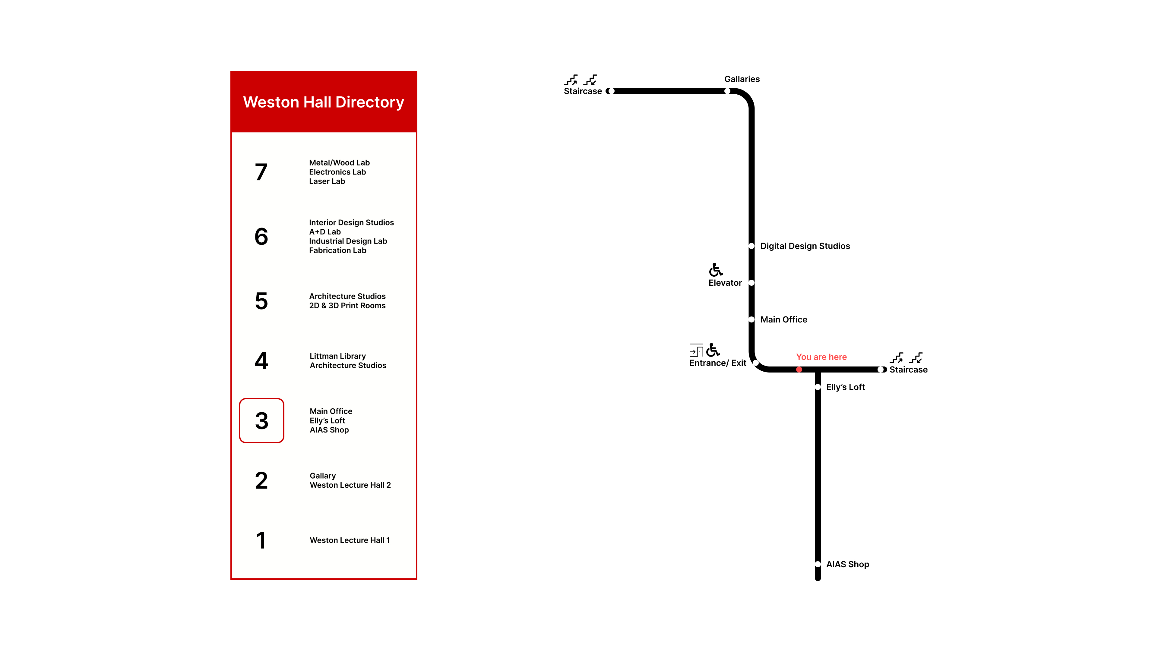
Wayfinding System Design

Enhancing the wayfinding experience of NJIT's Hillier Collage of Art+Design

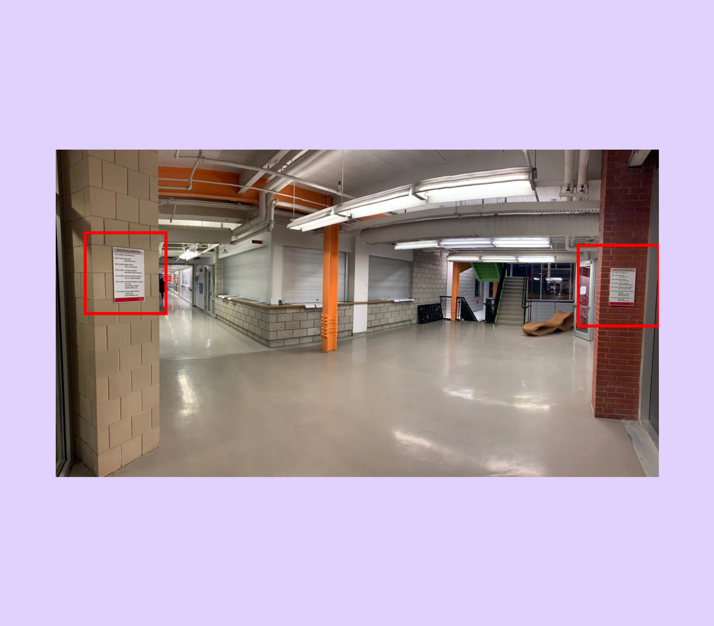
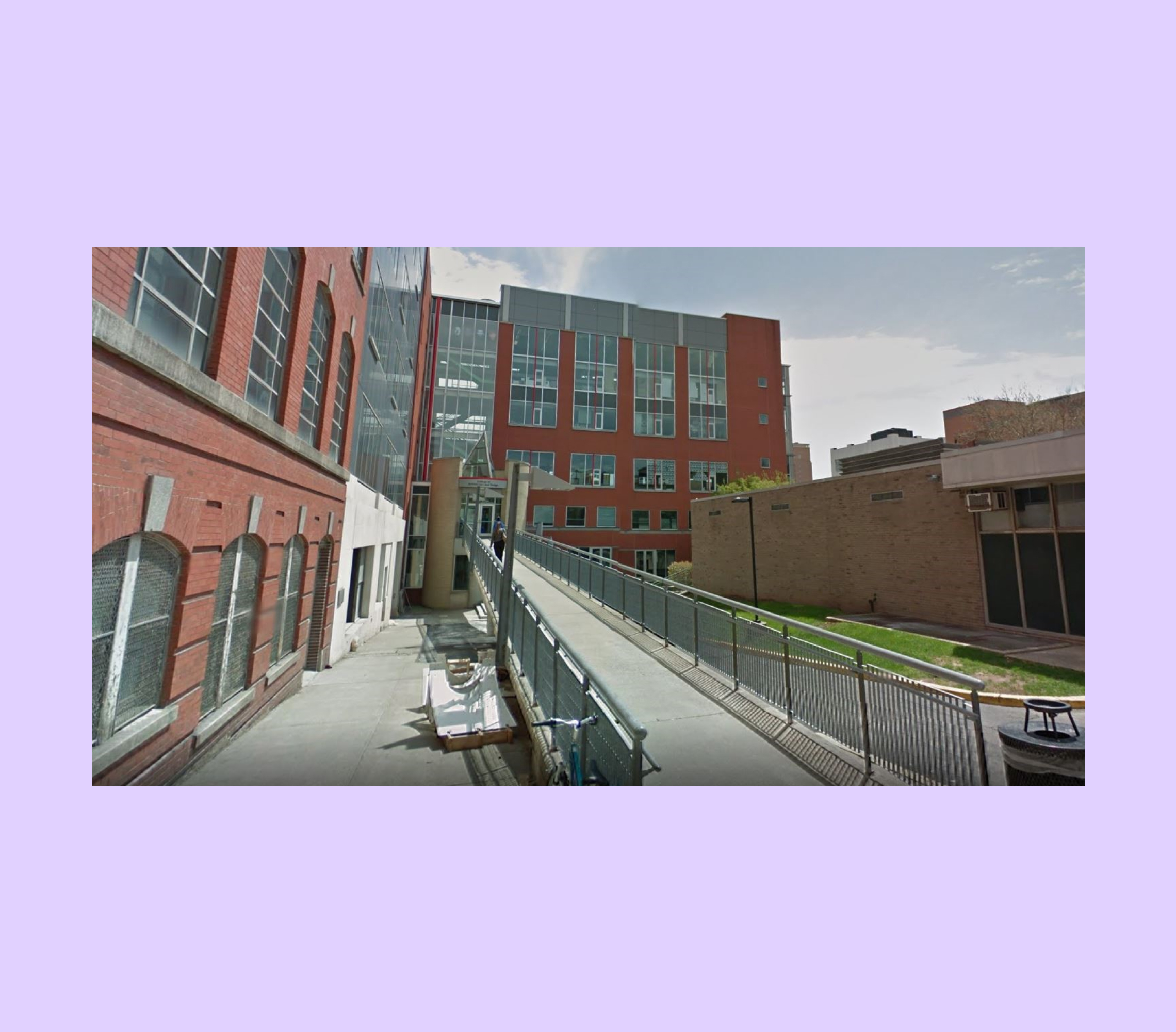
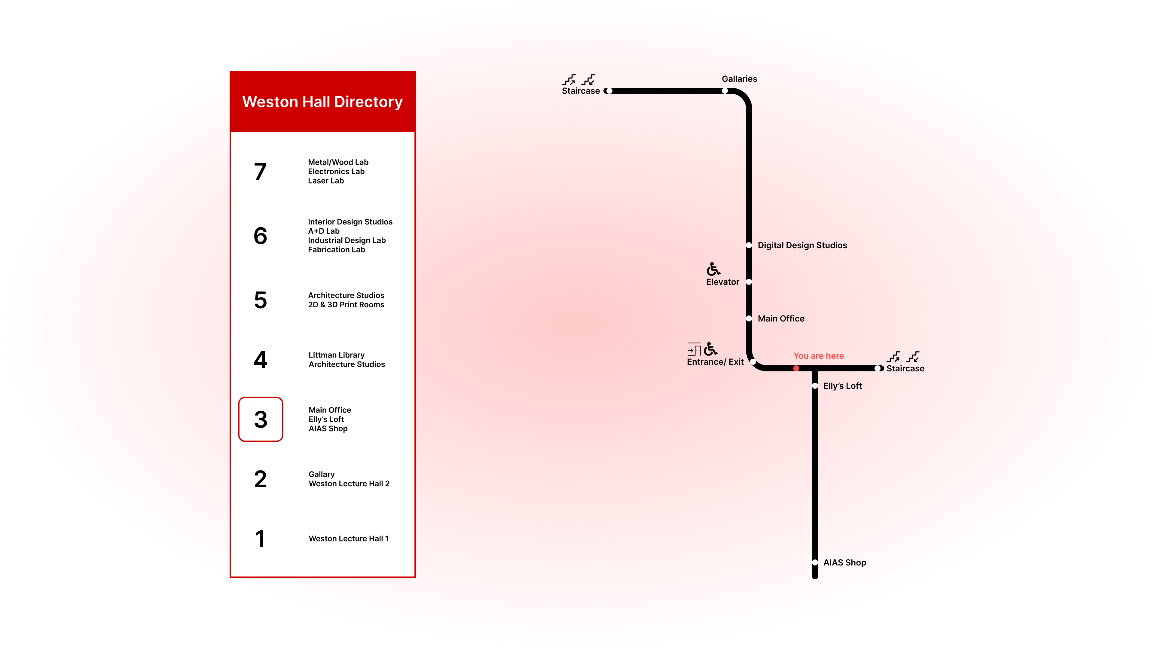
An interior design agency approached NJIT with a proposal to enhance Weston Hall's wayfinding for a high price and no explanation for design decisions. So I gave it a shot with a cross-functional team consisting of an interior designer (Lauren Soriano) and a digital designer (Bryce Short).

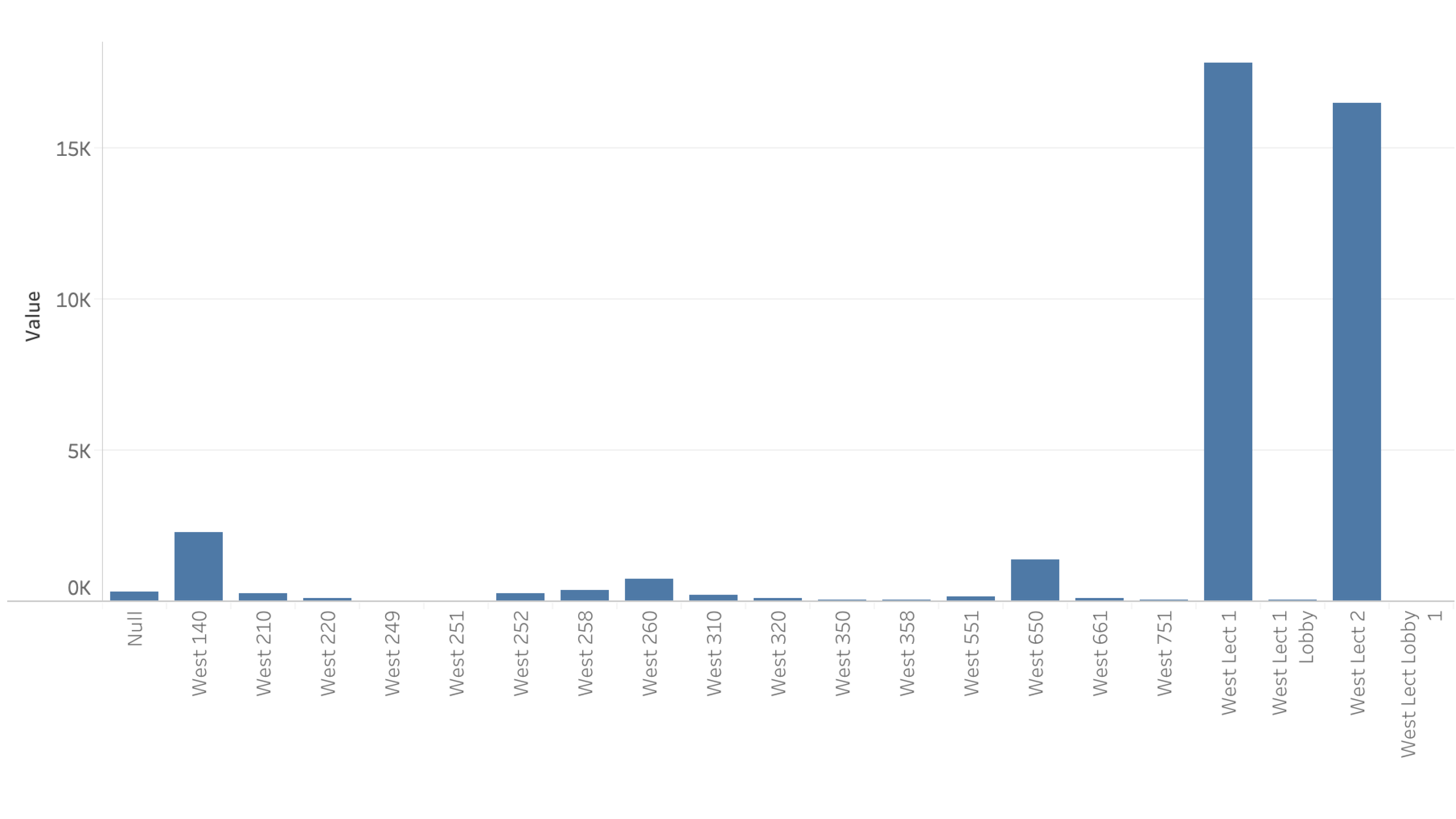
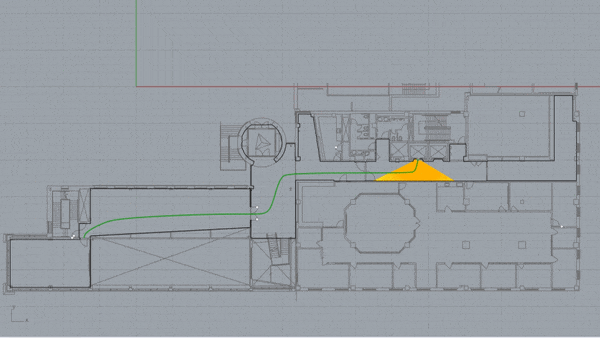
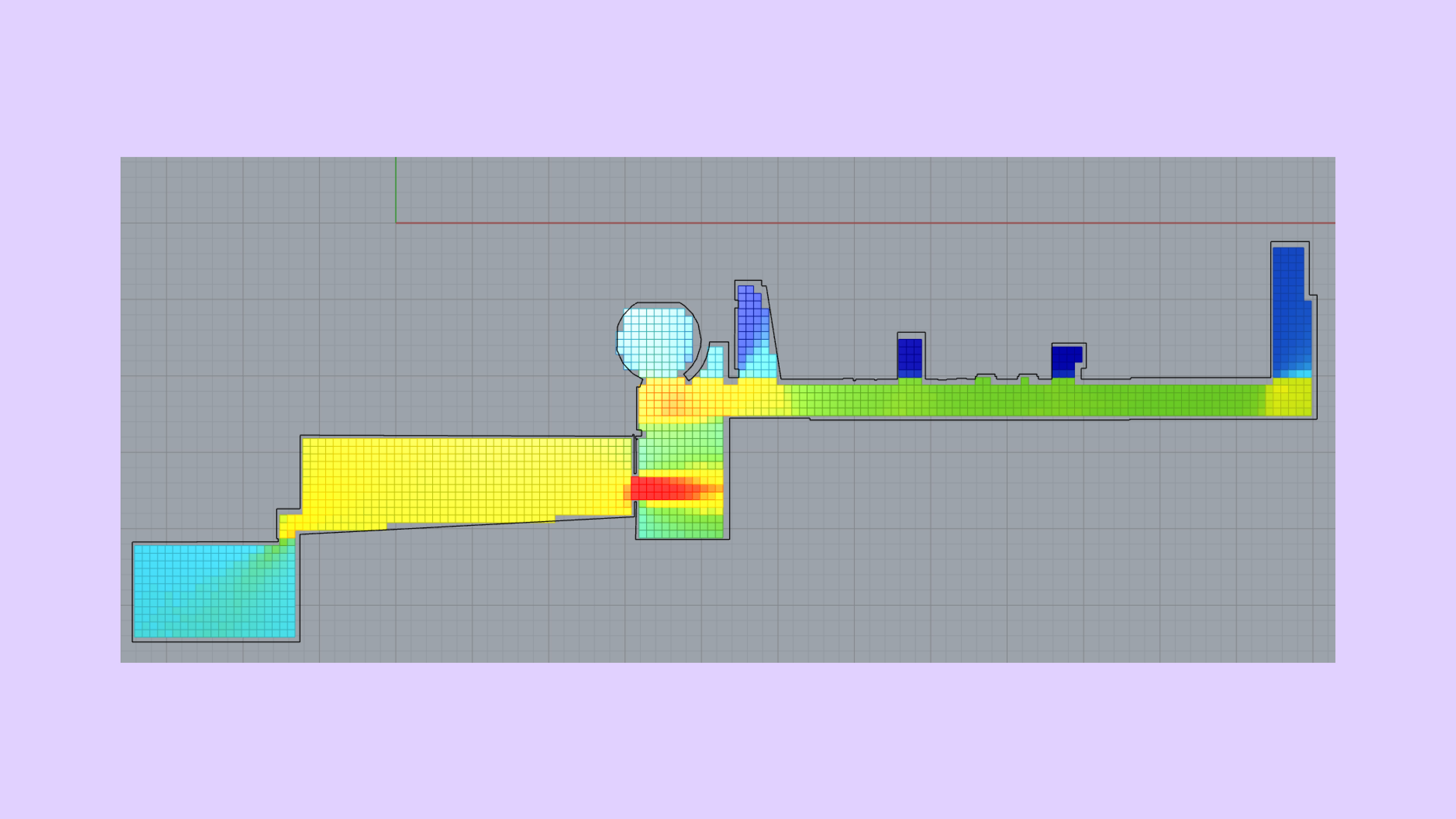
This project was very different from the Web/Mobile/VR work I was familiar with - yet used many of the same skills and experience. Like a UI, physical spaces also have components that need problem discovery, quant/qual evaluative research methods, and visual design working in harmony to have a meaningful user experience.

Is there a problem?

NJIT's School of Art+Design suffers from a less than optimal wayfinding experience for new students, as well as visiting professors.

For starters, the only signs upon entering are outside the standard monocular human visual field at 60 degrees; those two signs do not help in the navigation process.

Individuals also enter the building from the 3rd floor instead of the first floor because of a mandatory ramp. There is no indication that they are on the 3rd floor upon entering the building.

Modeling relevancy of rooms

Before considering the sign designs or testing methods, it was essential to prioritize what rooms were most important to students and staff in Weston Hall. This allowed us to allocate efforts in optimizing a relevant wayfinding path before testing the entire building.

So we went to the building admins and asked for any documents that could help us gauge the density of the building at any given time.

We received a PDF with information on student schedules that we manually converted into a CSV to visualize it better.

We discovered that the two rooms with the highest traffic were Weston Lecture Hall 1 and Weston Lecture Hall 2, so we built the test with that in mind.

Initial Eye-Tracking Test

I wanted to see where people gaze and fixate when naturally traversing the building, so I recruited 10 NJIT students rarely in Weston Hall and asked them to perform simple wayfinding tasks while wearing a Pupil Labs eye-tracker.

We found that students just walked until they found the room coincidentally or asked a person they crossed paths with.

The test validated the conjecture that Weston Hall was suffering from a wayfinding issue. Both from the current signage being placed in non-accessible locations and the signs themselves giving minimal contextual information.

Measuring Visibility

Using the grasshopper plugin on Rhino, we created isovists of floor plans of Weston Hall that we solicited from our ergonomics professor.

Isovists measure visibility in spaces. The process involves a floor plan divided into a grid. Each unit that can intersect with another unit increases the visibility score.

Red = High Visibility

Blue = Low Visibility

Read more about the technical stuff here if you're interested

We want to place signs that are in the path of a monocular human visual field at 60 degrees and place the signs in an area of generally high visibility.

This ensured that individuals with limited ability to scan a room could find the signs with less effort than they are used to.

Sign Design

Now that we had data to support where we needed to place the signs to potentially aid the wayfinding experience, we needed to actually design new signs.

The old sign's design only serves as an information dump. It shows the available rooms and floors without giving the user context as to where they are to where they want to be.

So we designed signs that displayed the relevant information in relation to the building's structural layout and the floor position the user was in. In contrast to the previous sign, which showed the first floor rooms at the top.

Qualitative Study of Sign Placement + Navigation

Using the data from the building density visualization, eye-tracking test, and isovist visibility measure, we placed the signs we designed in areas that had the highest visibility from entrances.

We, however, decided to run one more eye-tracking test after the signs were placed and had conversations with our users about their wayfinding experience.

We found out that the sign design and sign placement dramatically shortened the average time it took to acquire specific locations in Weston Hall. Users also felt the experience to be natural and convenient.

What we needed to work on was giving more direction to a person. So we designed another iteration.

The final product

Heavily inspired from NYC Subway Maps - This iteration adds a map to the directory to help a Wayfinder understand their spatial relation to their destination.

What we wished we could have done...

Floor signs would have helped the wayfinding experience immensely. It would take the cognitive load of mentally positioning a body relative to the sign design. Simply finding a destination and following the floor trail connected to the sign would have been great.

Unfortunately, constraints are a part of life. Weston Hall recommended against the signs to avoid construction interruptions within the buildings' day-to-day operations.